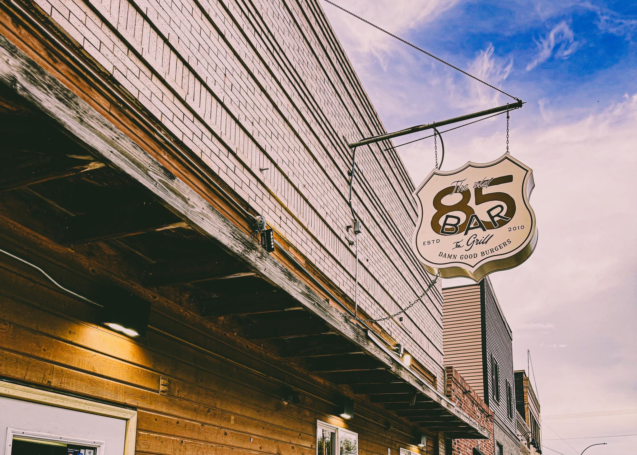
Client: The Old 85 Bar & Grill - Alexander ND
Scope:
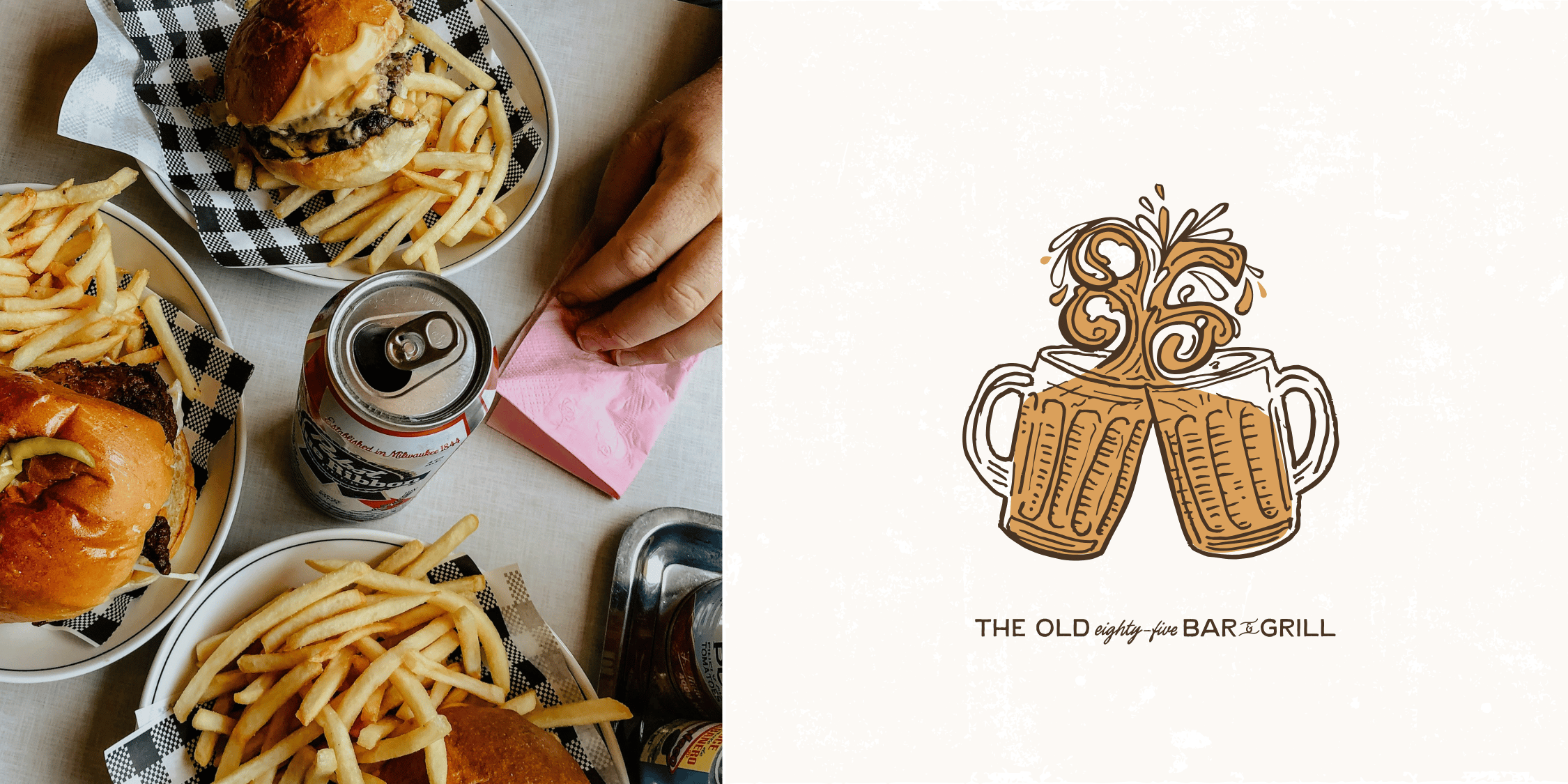
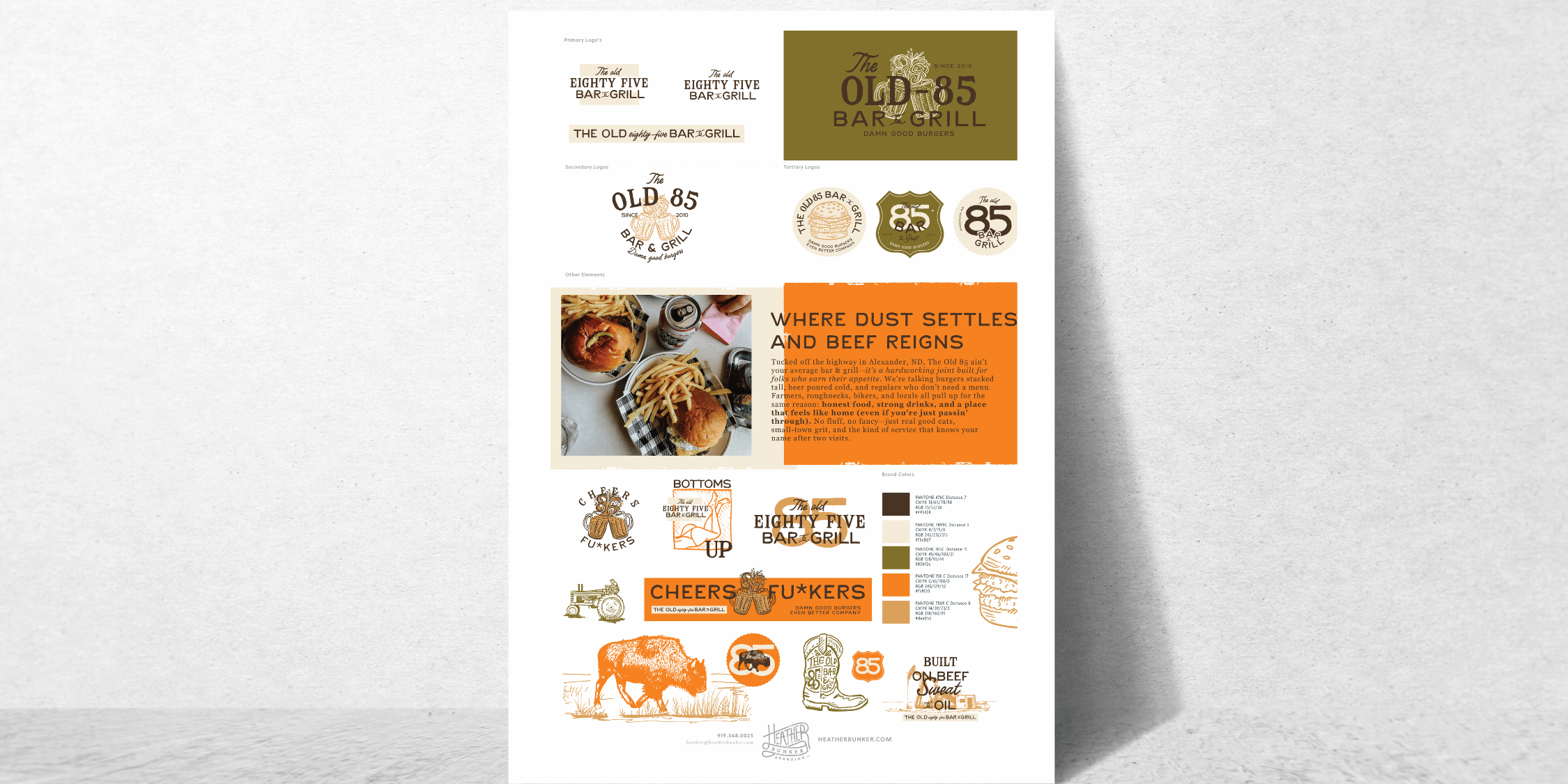
Brand Strategy, Visual Identity Design, Logo System, Typography Direction, Color Palette, Foundational Brand Assets, Brand Clarity & Direction
Objective:
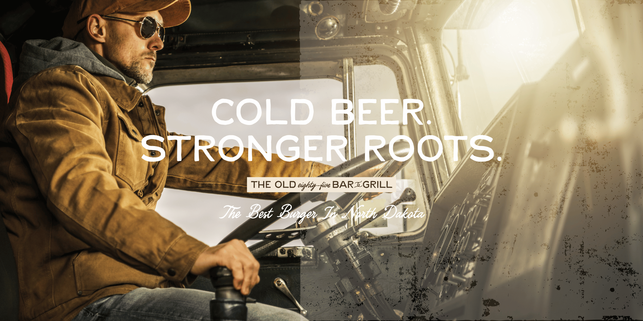
To create a clear, confident visual identity for an old-school small-town roadhouse bar — one that reflects its grit, friendliness, and reputation for the best burgers in North Dakota while giving the owners a brand system they could grow, advertise, and stand behind with confidence.
The Old 85 didn’t need to invent a personality.
It already had one.
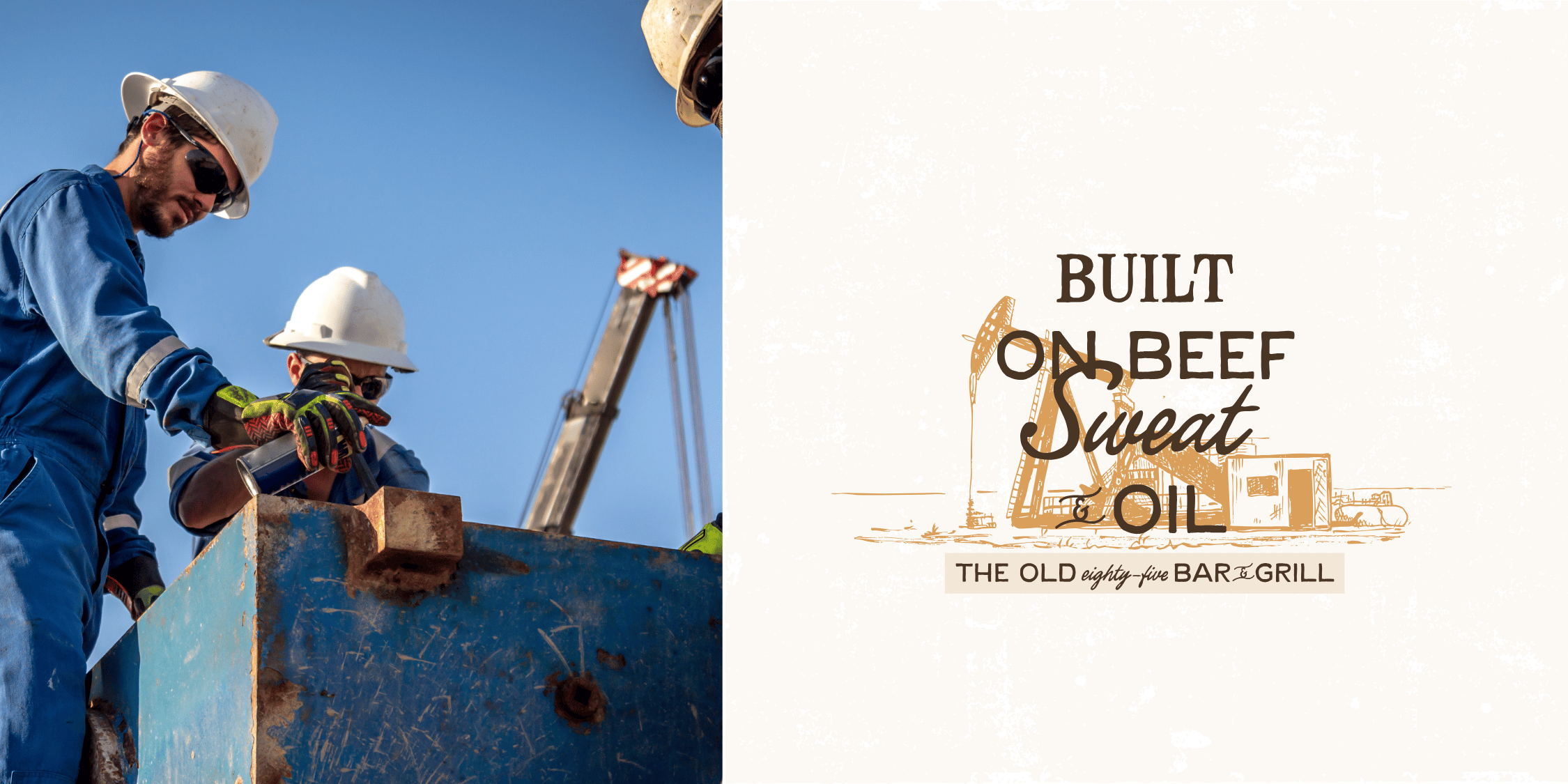
This is the kind of place where farmers, oilfield workers, locals, and travelers all end up at the same bar. Where everyone knows everyone — or at least knows your order by the second visit. A cold drink, a great burger, and real conversation.
What they didn’t have was a clear visual identity to match that experience.
The brand was relying on reputation alone — word of mouth, regulars, and consistency — but visually it wasn’t doing the heavy lifting it could. There was no unified look, no clear system, and no strong presence for advertising, signage, or future growth.
They weren’t trying to be fancy.
They just wanted to be seen for what they already were.
The strategy was simple — and honest.
We leaned into what made The Old 85 special instead of trying to dress it up:
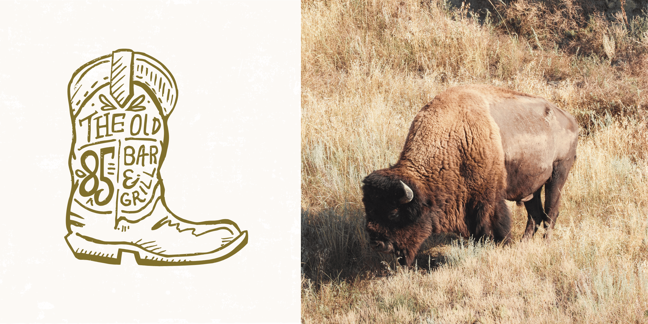
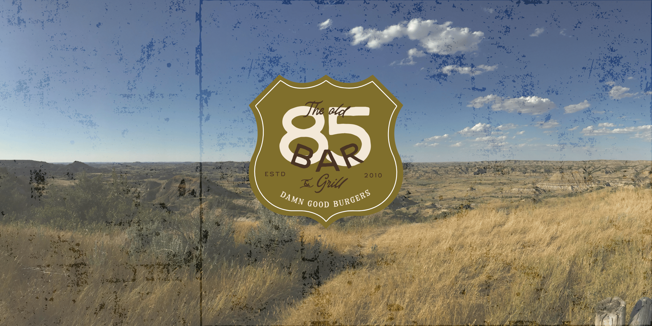
This is a biker / roadhouse bar at heart — but welcoming, cheerful, and rooted in quality and consistency.
The visual direction focused on:
Nothing trendy.
Nothing over-polished.
Just a brand that feels like walking through the door.
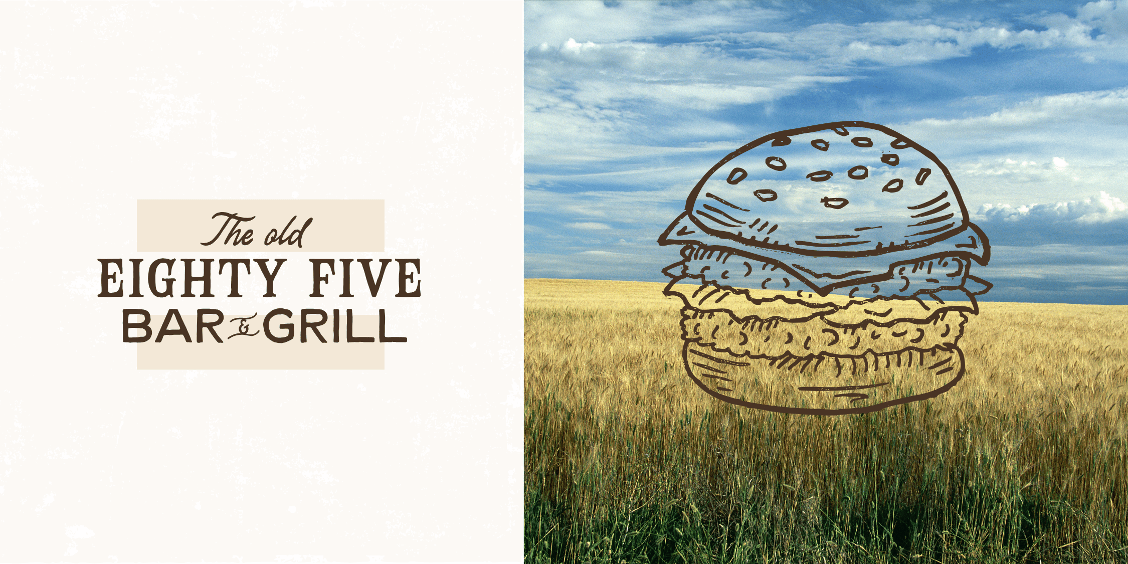
The Old 85 now has a visual identity that matches its reputation.
They gained:
The brand feels established because it is established.
Now it looks the part.
Branding isn’t about changing who you are.
It’s about clarifying it.
The Old 85 proves that you don’t need flash to stand out — you need truth, consistency, and a clear foundation. When your visual identity aligns with how people already feel about you, trust deepens and loyalty grows.
Great burgers.
Cold drinks.
A place people want to come back to.
That’s the brand.

If you’re ready to move your creative business forward, let’s have a conversation. Book a chat with me here!
BOOK A CHAT
Ditch the burnout, charge what you're worth, and build a six-figure creative business—without sacrificing your passion or freedom.

